Concept Development
What is Concept Development:
I really enjoy transforming ideas into visually compelling designs. I see it as creating intriguing gateways into your narrative and enticing potential readers to explore further.
Through my creative process, I ensure that your projects receive a tailored design for your target audience, enhance brand and recognition, and form collaborative partnership that delivers a cross-functional press release.
When is Concept Development the best approach?
If your project needs fresh eyes or a groundbreaking approach, concept development is for you. Using my expertise in generating innovative ideas and pushing the boundaries of design, I breathe new life into a project. I infuse it with fresh perspectives and ensure a visually stunning book cover with stand-out appeal.
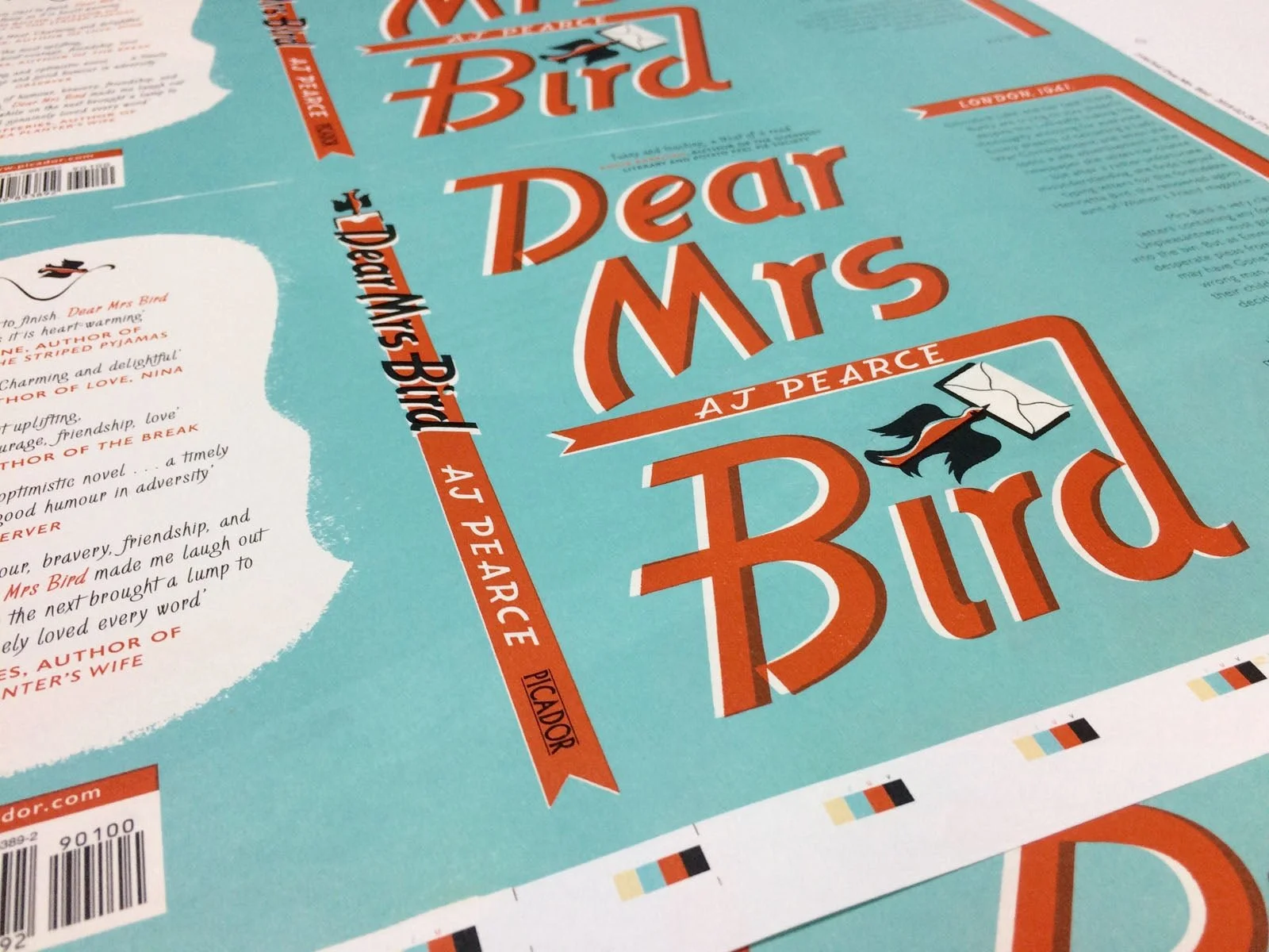
Learn more about my process for creating a branded series style for author AJ Pearce and her debut novel Dear Mrs. Bird.
What was the Brief?
This was Picador's big literary-commercial debut of 2018, acquired at auction, and a book for which they had commercial aspirations.
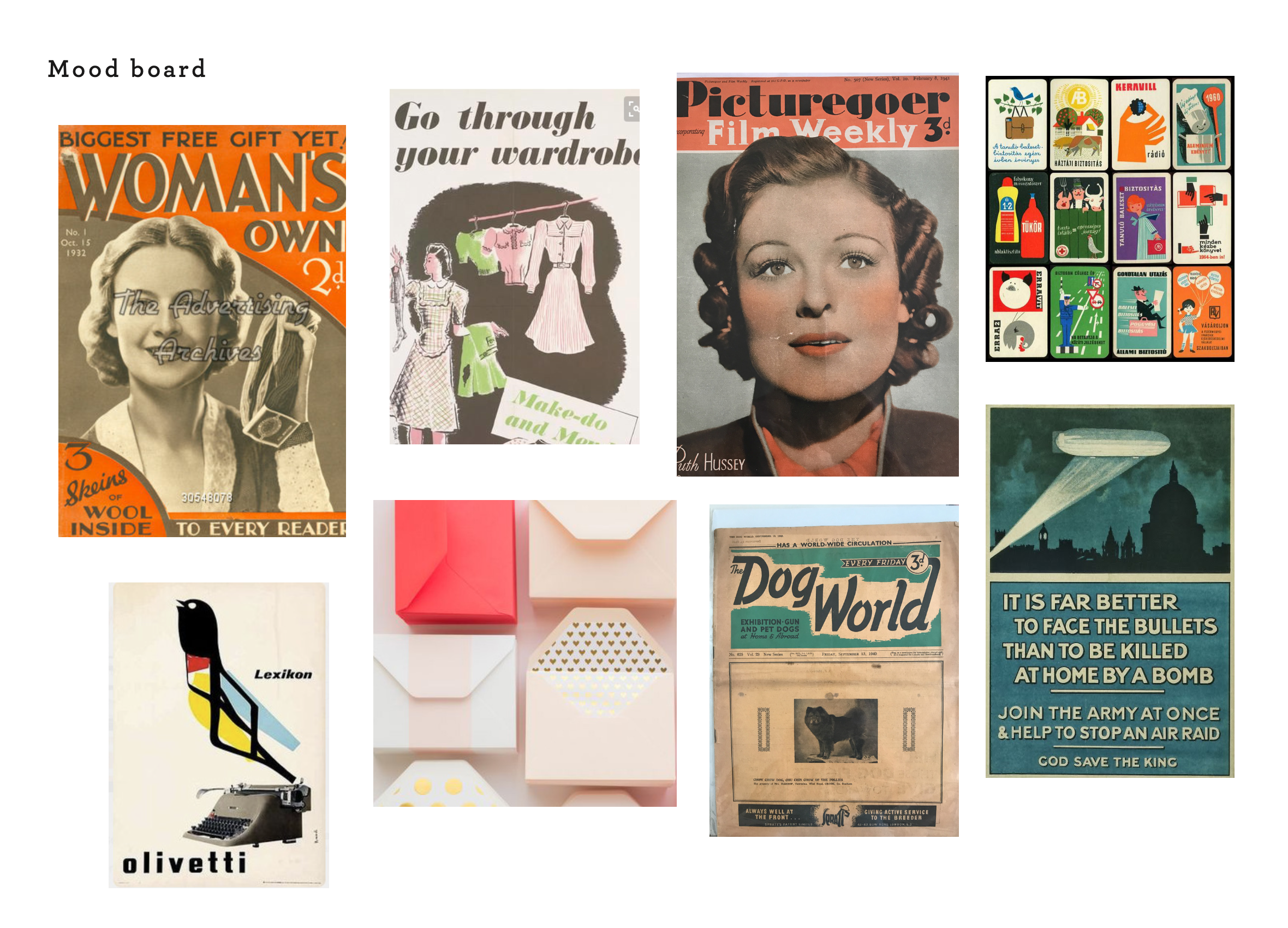
They wanted an original design to bring the book to life that showcased the period and enticed as broad a readership as possible. Using the author’s personal treasure trove of 1940s magazines, letters, photos, and advertisements as a muse – this title was briefed to be headlining, type-led, and vintage women’s magazines inspired. Getting something beautiful and with the right atmosphere was most crucial.
Who Were The Competition
-

Everyone Brave is Forgiven by Chris Cleave
For its sense of place and time.
-
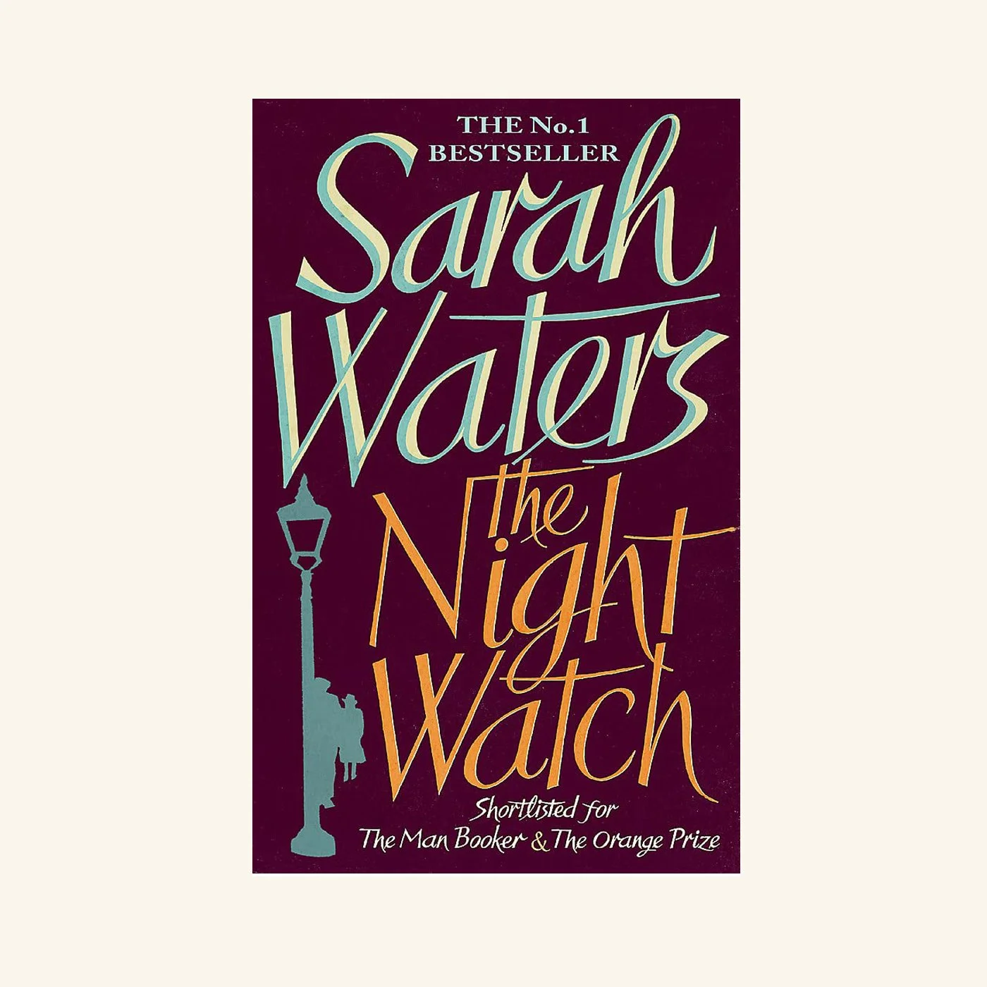
The Night Watch by Sarah Waters
A period-type led cover. Bold and striking.
-

The Guernsey Literary [ ... ] by Mary Ann Shaffer and Annie Barrows
For its warm and engaging storyline. The similarity in emotion and tone.
What Was My Process
Prioritizing the book’s warm-hearted, funny, moving, uplifting spirit, I made this cover a love letter to female friendship. A homage to letter writing itself.
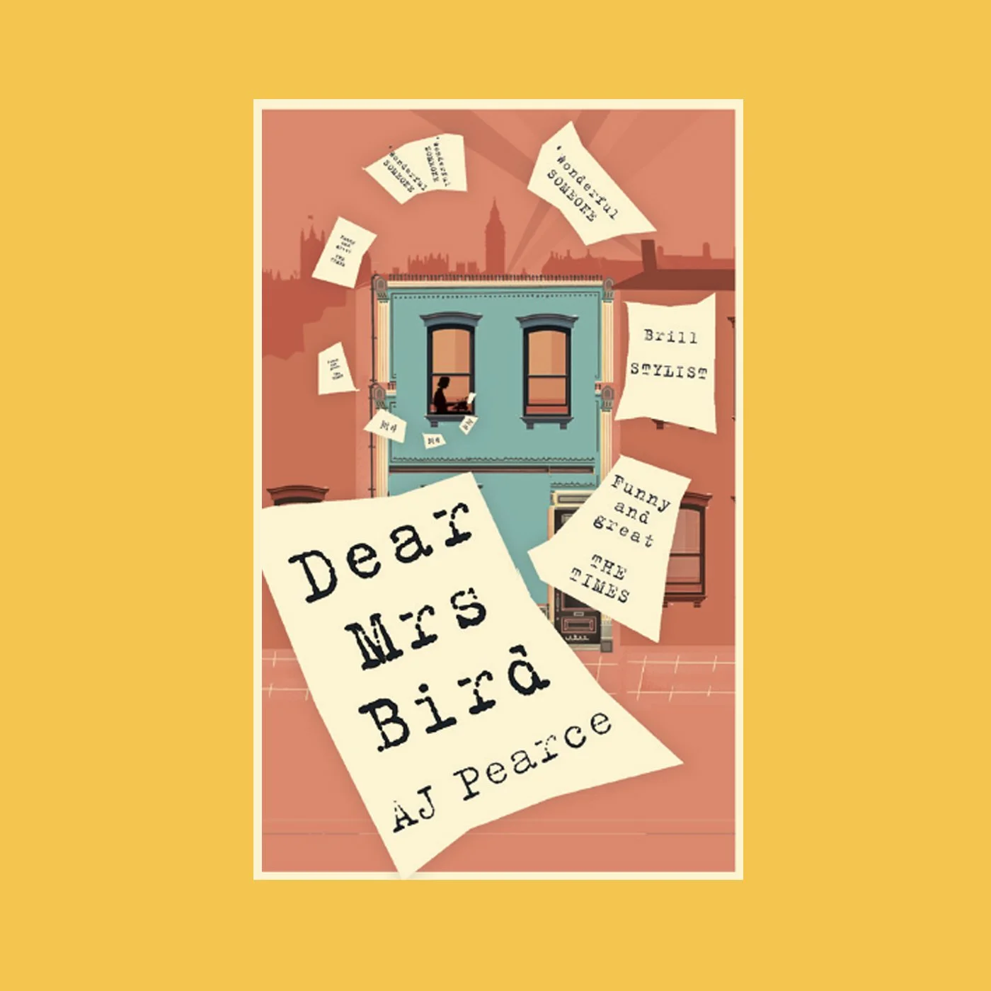
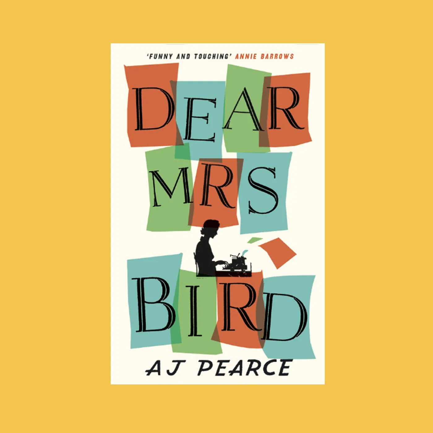
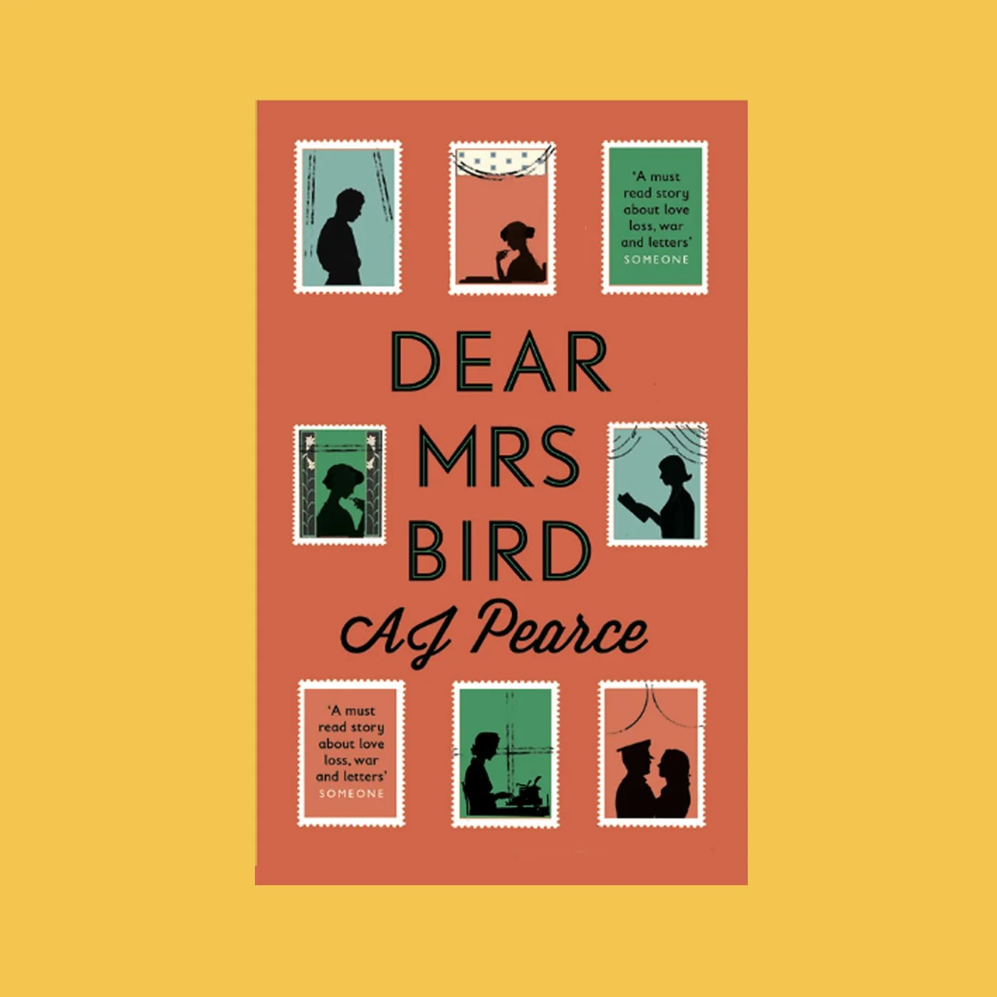
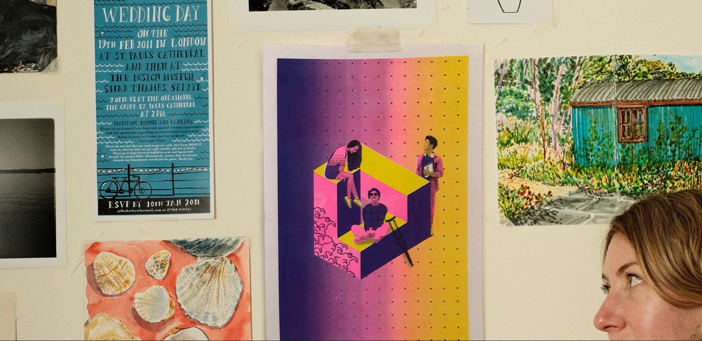
This was my mood board:
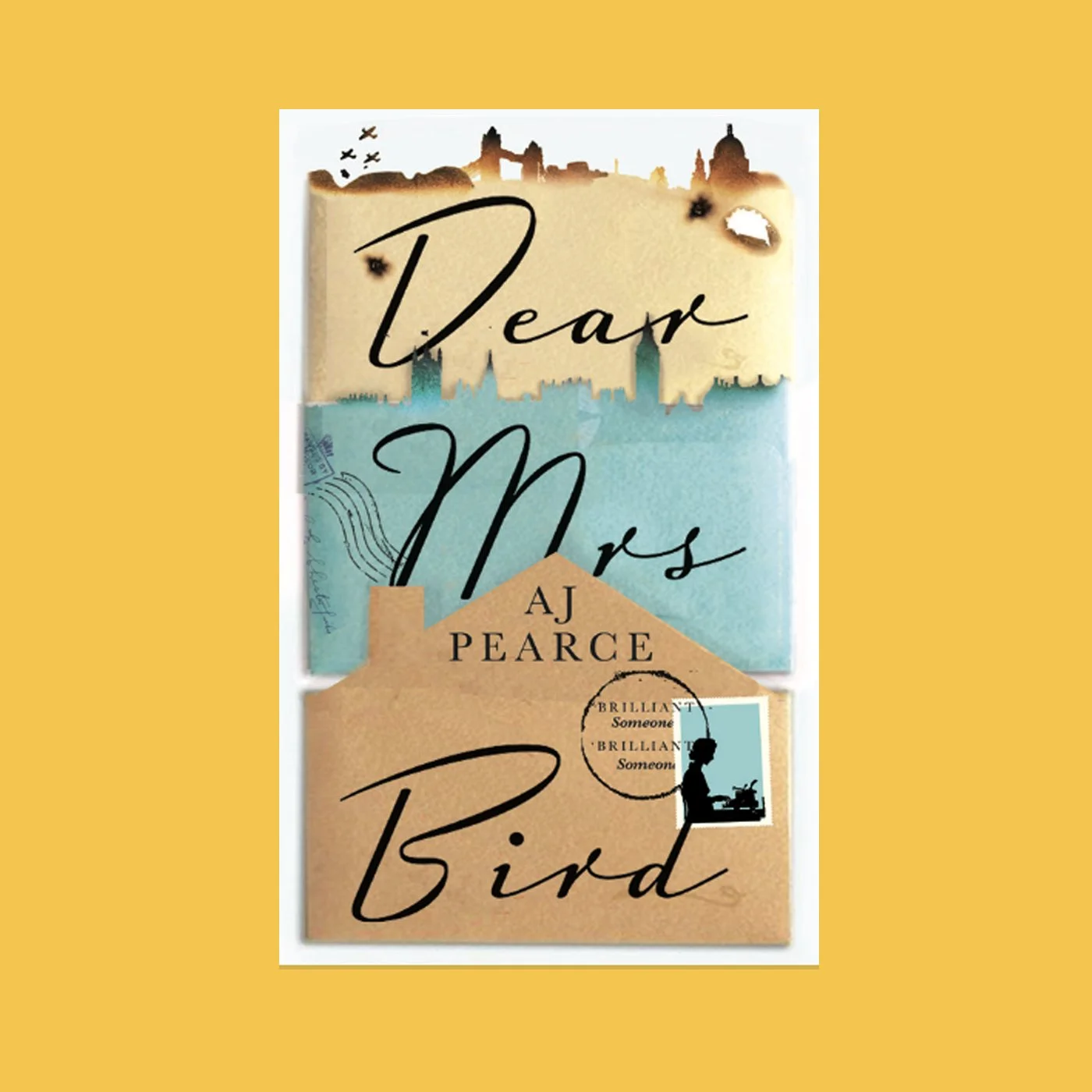
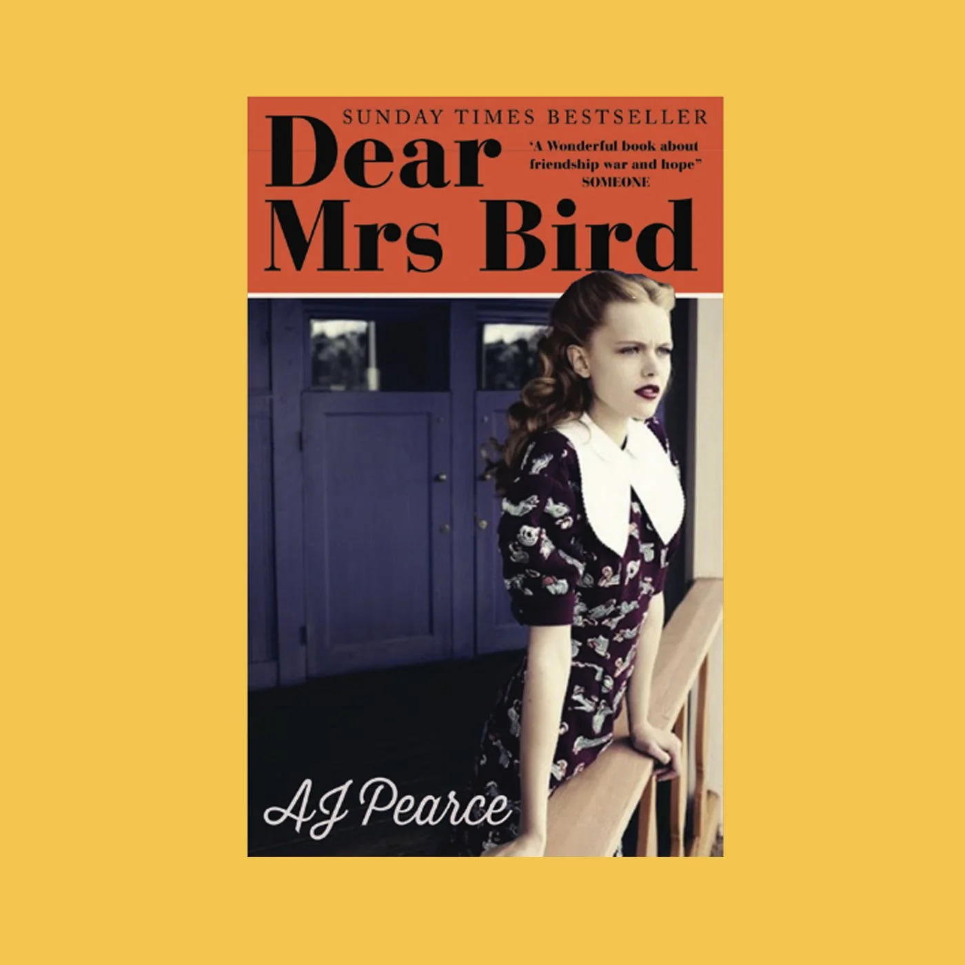
The Approaches
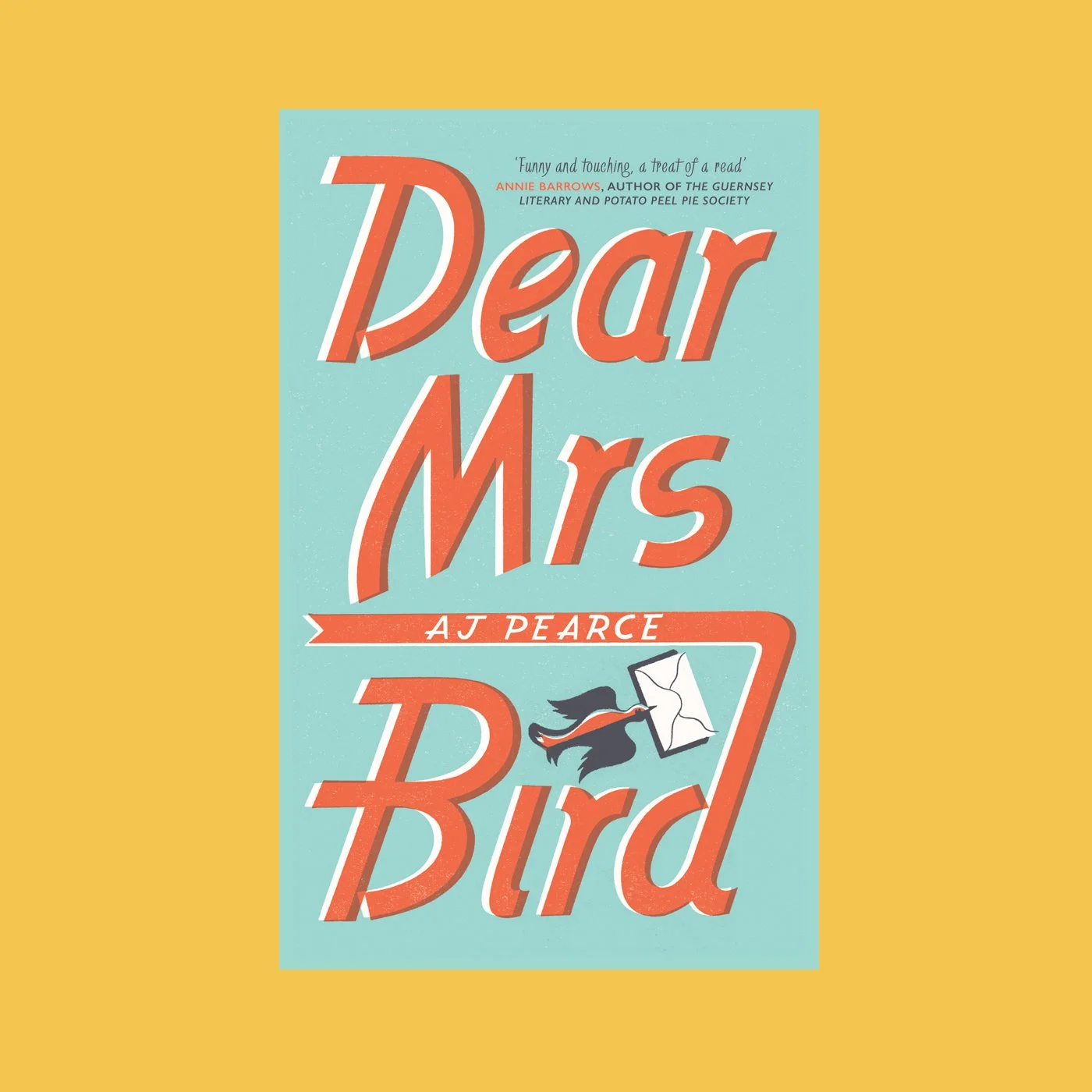
The Winning Concept
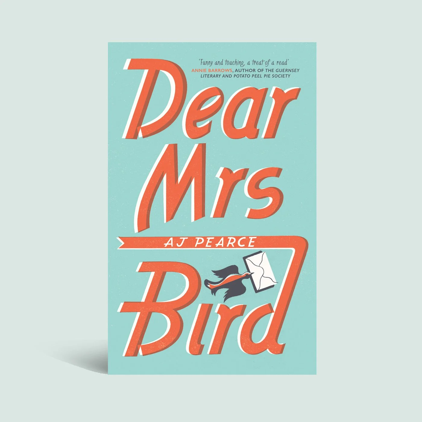
The chosen design is bold, simple, and authentic in its rendering, giving Dear Mrs Bird a distinct and confident look that instantly transports you to the 1940s.
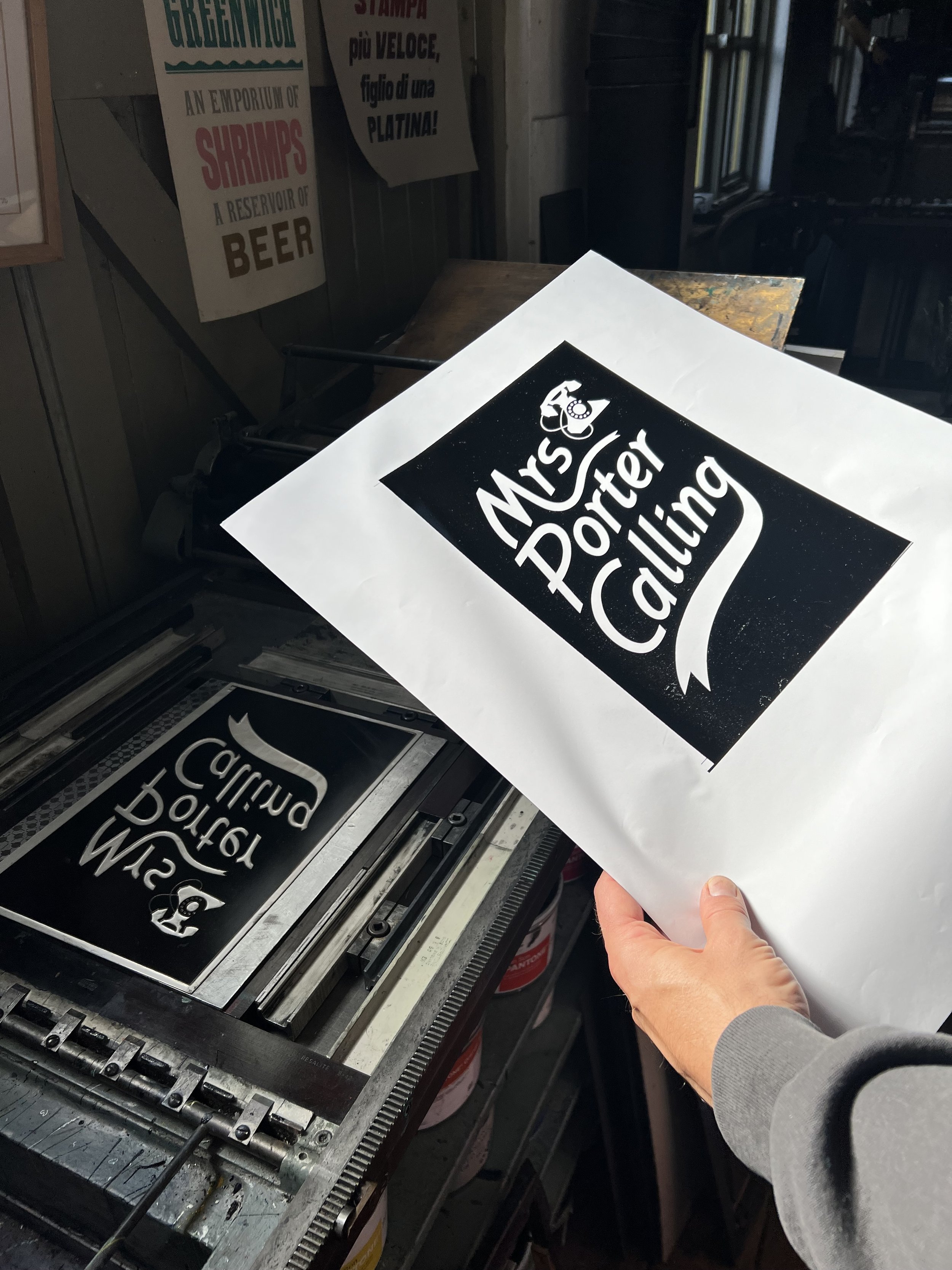
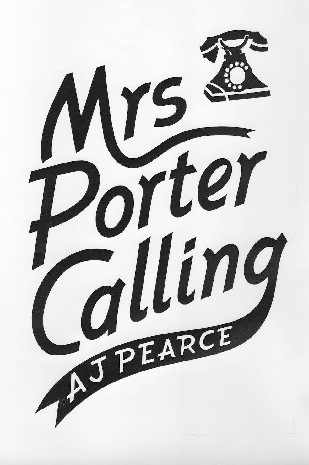
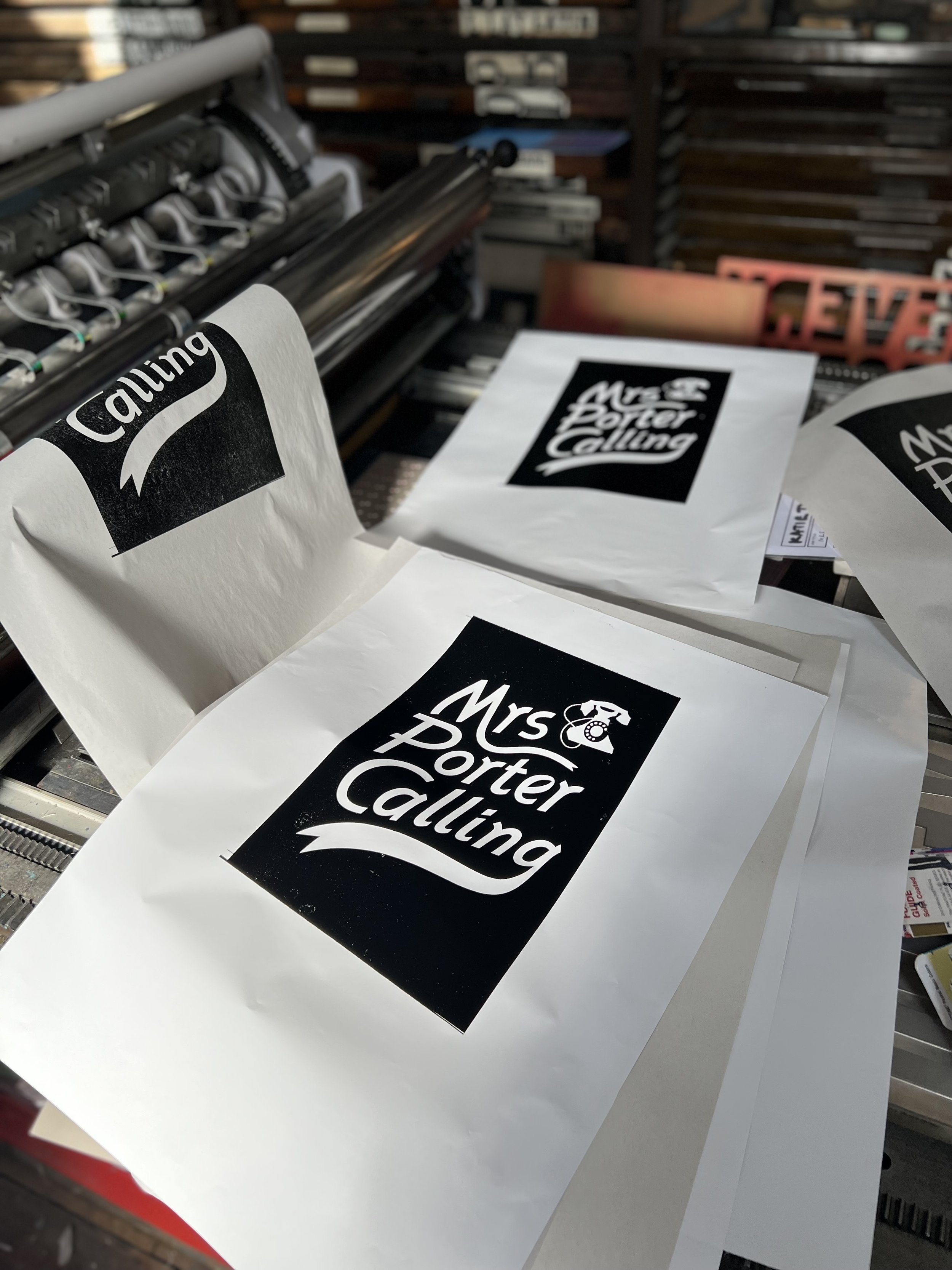
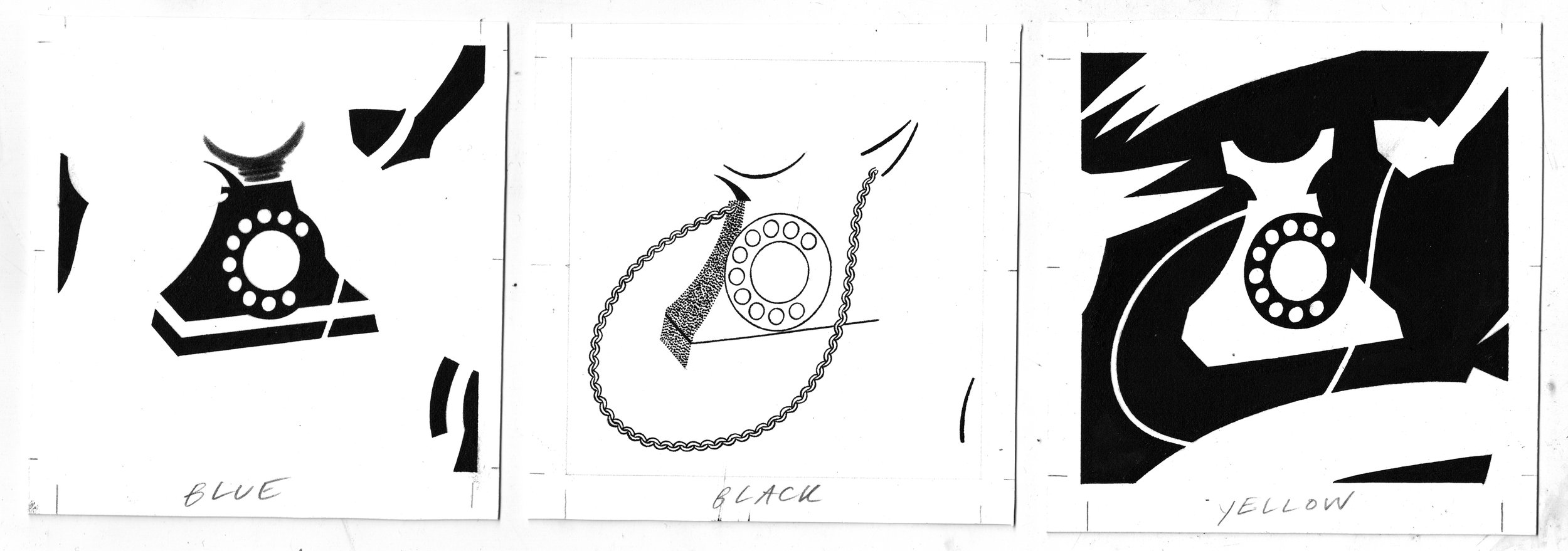
The typography was inspired by a treasure trove of 1940s and 50s magazines owned by the author. Emily Sutton was commissioned for her period typography, wonderful eye for detail, and her 1940s style. Emily worked with Typoretum, a letterpress printing & design studio, who printed the layers onto letterpress plates giving the final cover its integrity.
The design style was continued over onto the paperback and subsequent hardbacks in the series, Yours Cheerfully and Mrs Porter Calling.




"In a crowded genre (historical fiction) where it is so hard to stand out, Katie’s work on The Emmy Lake Chronicles has been brilliant. My book covers leap out from shelves and screens, and after three novels there is still nothing else that looks like them. It’s been a privilege to see Katie take the essence of what I write and give it a visual identity that I love."
AJ Pearce
Author of Dear Mrs. Bird, Mrs. Porter Calling, Yours Cheerfully
Do you love a historical treasure?
Check out my illustrated collection for A la Ronde in Devon, UK.


